It’s been a while since the last time I wrote one of these missives. Hopefully you’ve been happy with the content of our other emails that come to you several times per week, along with regular updates to our website. As the unofficial beginning of fall is here marked by the Labor Day Weekend, I thought it time to fill in any blanks left by all our other communications.
Offsetting Indicators
As long-time readers know, I use three categories of indicators to develop what I call my “investment posture”. Those categories are monetary conditions, valuation, and investor psychology. When all three indicators align our choice of investment posture is simple: either offense (bullish posture) or defense (Bearish posture).
Most of the time it’s not that simple. For example, the psychology category improved ever so slightly last week, but it was more than offset by the deterioration in monetary conditions. Valuation has remained low for quite some time, with the forecast for stock market returns holding at an average return projection of about 3.3% per year for the next 10 years.
One shorter-term indicator flashing a warning sign is the CBOE Equity Index Put-Call Ratio. Call options are basically bets that stocks will go up, and puts are bets they will go down. Puts are useful to hedge against stock declines, but most traders use them for speculation. Any time this ratio exceeds about 1.4, I start getting a little concerned that a sell-off in stocks could occur soon. The current ratio spiked to end the week to 1.78![1]
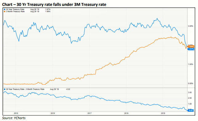
Another indicator giving me cause for concern is the yield curve. The yield curve shows us what the various interest rates are for different maturities. Normally, the longer period for which you tie up your money, the higher rate of interest you can expect to receive. That is not the case right now. There is enough concern that rate could fall, which happens in weaker economic conditions, that the prices of longer-term debt are rising. They have now risen to the point that the 3 month Treasury Bill now pays more than the 30 year Treasury Bond.
There are a number of reasons for this to have occurred.. One is that for the past year, global economic conditions have been slowing. We’ll look at a few indicators of the US economy.
Other Causes for Concern
One item that could negatively impact our economy is the trade war and the accompanying tariffs.
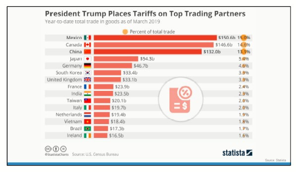
The United States has had strong trade relationships with many countries. These countries are our top trading partners, ranked by exports. Recently, the United States imposed tariffs on goods from some countries. A tariff is a tax that a company pays when it imports goods from another country. Most often, the tax is passed through to consumers.
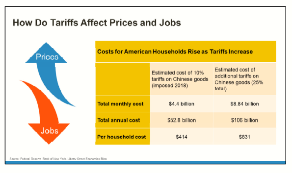
Tariffs and retaliatory tariffs have the potential to constrain business, slow job creation, increase consumer costs, and slow economic growth. It works like this: When a country puts tariffs on goods from another country, the companies that buy those goods pay a higher price for them. Often, the increased cost of the goods is passed on to the consumer and demand drops.
For example, if the United States set a 25% tariff on cars imported from the European Union, the cost of those cars in America would increase by 9%, on average. Sales may decline and the European automotive sector IN THE US could lose jobs. It takes a while for the effects of tariffs to trickle down. We’re only now paying the cost of the original tariffs. The government has raised those tariffs and expanded the amount of products on which tariffs are imposed.
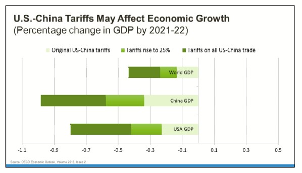
Tariffs also have the potential to hurt economic growth and tip our economy – and other countries’ economies – into recession. The numbers crunched by the Organization for Economic Co‐operation and Development (OECD) suggest that escalating trade conflict could slow economic growth in the United States, China, and the world. The original 10% tariffs on some Chinese imports would have had a small effect on growth. Twenty‐five percent tariffs on those goods have a bigger impact.
The effects of these may already be taking hold. The labor market seemed to defy gravity last year, generating more than 200,000 jobs a month despite a historically low unemployment rate that made it harder for employers to find workers. It turns out job growth wasn’t as robust as it appeared.
The Labor Department revised down total job gains from April 2018 to March 2019 by 501,000, the agency said Wednesday, the largest downward revision in a decade. The agency’s annual benchmark revision is based on state unemployment insurance records that reflect actual payrolls while its earlier estimates are derived from surveys. The preliminary figure could be revised further early next year.
The large change means job growth averaged 170,000 a month during the 12-month period, down from the 210,000 initially estimated, according to JPMorgan Chase.
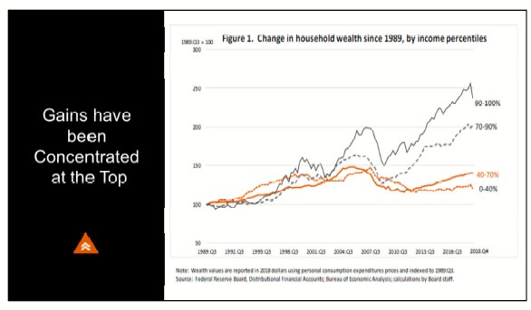
One of the main drivers of the economy is consumer spending, and the largest group of consumers is the middle class. While US household net worth has climbed to record highs, those gains have largely been consolidated among the top 30% of income earners.
Here you see change in net worth from 1989 through the end of last year. You can see the impact of December’s downturn on the wealthiest Americans.
Fed Governor Lael Brainerd provided this chart in a recent speech. It shows, during the past three decades, the wealth of middle‐income households – the 40% to 70% group – has increased about 1% per year after inflation. The wealth of Americans in the top has grown three times as fast. The difference has increased since the Great Recession. Middle income families have not recovered the wealth they lost during the downturn, while the net worth of the wealthiest Americans was up 19% at the end of 2018 – before first quarter’s recovery in the stock market.
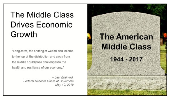
If you believe having a strong middle class – and by that I mean families with average incomes that have the means to buy goods and the savings to invest – is the cornerstone of a vibrant economy and a resilient democracy, then income inequality is a problem.
Governor Brainerd put it this way: “The discrepancy between slow growth in income and wealth, on the one hand, and rising costs of housing, health care, and education, on the other, may be making it more difficult for middle‐income families to achieve middle‐class financial security. Long‐term, the shifting of wealth and income to the top of the distribution and away from the middle could pose challenges to the health and resilience of our economy.”
Changing circumstances are apparent in data about the net worth of Millennials relative to other generations at the same age. According to a recent report, the net worth of consumers under the age of 35 has fallen by 34% since 1996.[2]
As an Investor, What Should You Be Doing Now?
For many Americans, an important component of net worth is the value of investments. No matter where you are on the income spectrum or what your net worth is, if you’re an investor, you were probably very happy with year‐to‐date performance. So as an investor, what should you be doing with your portfolio now?
For some perspective on the answer to this question, let’s refer to our old stand-by, the NYSE Bullish Percent Chart.
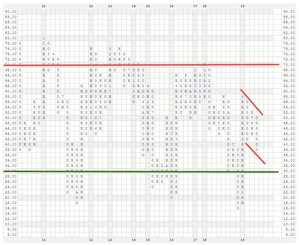
For those of you long time clients and other readers, you’ll recognize the point and figure chart.[3] Rather than recording prices over a fixed period, point and figure is a measure of supply and demand irrespective of time. Shifts occur when they occur. X’s denote upward movement, or demand, and O’s denote downward movement, or an excess of supply. The letters and numbers embedded within the columns indicate the month of the year that the movement was recorded. As you will note, the years (across the bottom) are not all of the same size. That is because only actual changes were recorded, and some years there are more changes than others. The numbers one through nine signified January through September, and A, B and C are October through December.
This particular chart does not measure price but rather the percentage of stocks on the New York Stock Exchange (really big companies) that are in uptrends versus downtrends. As you can see, the chart has been trending downward since April.
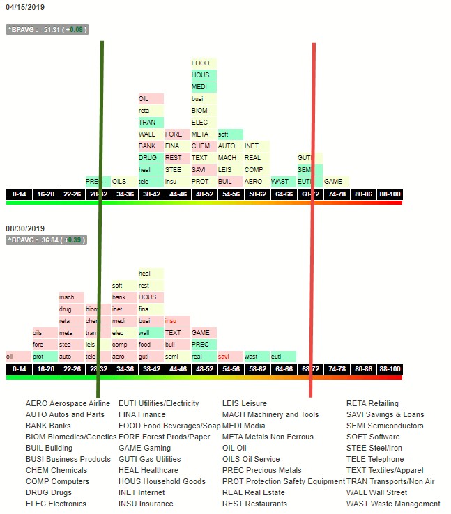
A little “deeper dive” in the chart below[3] shows us how each economic sector within our economy performed during the same period. This chart shows the 40 or so major industry sectors that comprise the economies of major industrial nations, including ours. Each “brick” represents a sector. The position of the brick represents the number of companies within the sector whose stock prices are trending up versus trending down.
For example, if the brick is in the 64 to 66 column, it means that 64 to 66 percent of the companies in that sector are in uptrends. If the sector symbol is in uppercase letters, it means that the sector is gaining strength. Lowercase means the sector is losing strength. Once all the sectors begin piling up to the right of the chart, you would say the market is becoming overbought, which is a higher risk condition. Piled to the left would be oversold, meaning that much of the risk has been rung out. Ideally, you’d like to buy a stock in a sector that has moved far to the left, and then shows uppercase font, meaning it is starting to move up from a lower position of risk. Overall, you would prefer to put money to work in a market where many or most sectors display these characteristics.
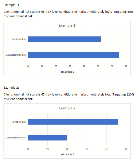
You can see that according to these charts[3] market risk levels have certainly fallen, but this isn’t the time to go “all in” with regard to your portfolios. It’s true that you want to hold lower risk investments when market risk levels are high and vice versa. But more and less compared to what? We measure each clients risk tolerance using tools that allow us to quantify the client’s risk on a scale of 1 to 100. Let’s assume a client tested to a score of 65. We call that their nominal risk score.
It’s also possible to quantify risk in the client’s portfolio on the same scale. Basically the last 6 months’ volatility of each investment is measured, then extrapolated to the next 6 months. Based on the investment’s score and its weight in the portfolio, we can assign a customized risk score to that client’s portfolio. In times of higher market risk you would want a lower portfolio score.
Here’s are two examples:
We used to adjust risk by use of asset class. If we wanted lower risk we would hold fewer stocks and more bonds. If there was also risk in the bond market, we’d move to cash. Of course, holding cash meant locking in lower portfolio returns while we waited for the risk to subside.
Recent advances in technology have provided better tools. Our alliance with Carson Partners in January gave us previously unavailable access to these tools. We now can differentiate between low and higher risk stocks, for example. This helps to achieve lower risk levels while not holding cash.
We started the year targeting 70 percent of a client’s risk. We’ve since increased that to 80 percent. Once we see a significant reduction from here, which will probably include a correction and re-test of the lows, and may go to a portfolio risk level of over 100 percent of the client nominal risk score.
Action You Can Take Now
Something you can do is to know your risk tolerance, and what the risk is in your portfolio(s). If you are currently a client of Navion Financial Advisors, use this link to schedule an appointment for a virtual meeting to review your risk score: https://calendly.com/joel-larsen/risk-profile-virtual-meeting. If you are not a client but would like to discuss how to about the process of determining both your personal risk score and that of your investment portfolio, use this link: https://calendly.com/joel-larsen/15min. We will start with a telephone conversation and go from there.
I hope you’ve enjoyed this long-ish message. As always, feel free to send it along to anyone who might benefit from it. If you have any questions or comments, please contact us via our website, www.nfadvisors.com. Thanks!
Joel
[1] https://www.cboe.com/data/current-market-statistics
[2] Source: US Census Bureau
[3] Chart Source: Dorsey Wright Charting Service, annotations mine.


